Artvoom — your destination for decorative wooden panels and stylish home decor — presents its blog filled with practical tips, this year’s top trends, and inspiring ideas to refresh your living space.
https://artvoom.com/collections/wide-wooden-wall-slats/products/wide-walnut-wooden-wall-slats-24-pcs-in-box-artvoom-wall-decor
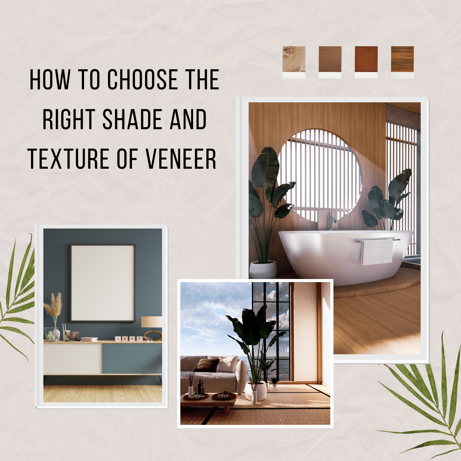
When selecting natural wood veneer overlays, it’s important to consider several factors: color, grain texture, and the overall style of your space. A thoughtful combination of these elements will help create a cohesive look and highlight your personal aesthetic.
The first step is to choose your wood shade. Light-toned oak or ash overlays are ideal for bright, airy spaces in Scandinavian or minimalist styles. Rich, darker finishes like walnut or wenge work beautifully in classic, modern, or industrial interiors.
Grain texture is just as important. For calm, neutral rooms, go for overlays with a smooth, even grain. If you want to add character and depth, opt for veneers with bold, expressive grain patterns or a “live wood” effect.
You should also consider how your chosen overlay will coordinate with other elements in your space — such as flooring, doors, and countertops. It’s best to match or subtly echo the tones of at least one other major piece in the room to create a sense of visual balance.
Lastly, decide whether you want your furniture to be a standout feature or a subtle backdrop. If you’re after a statement piece, go for a contrasting shade. For a more seamless look, choose overlays in tones similar to your existing decor.


